
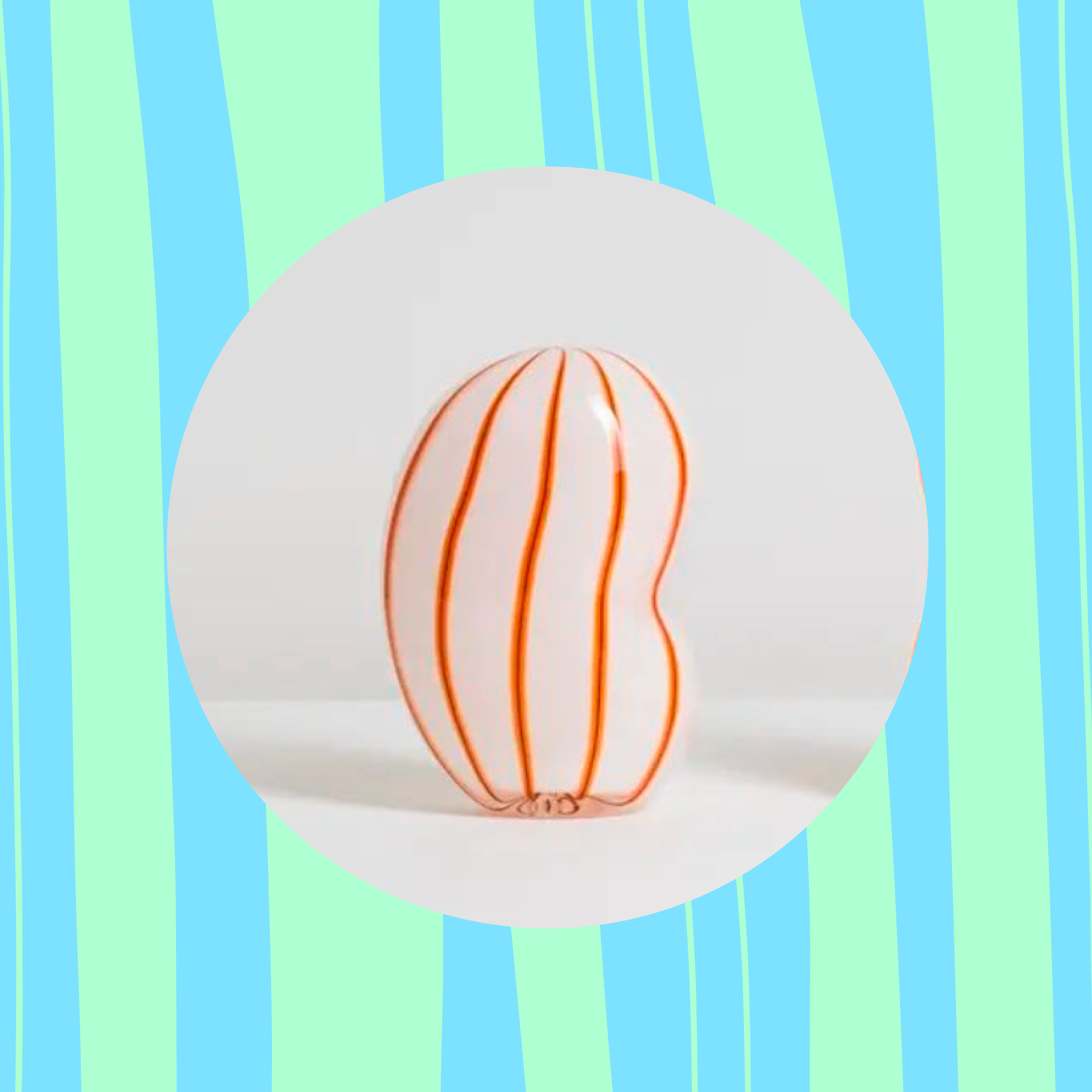
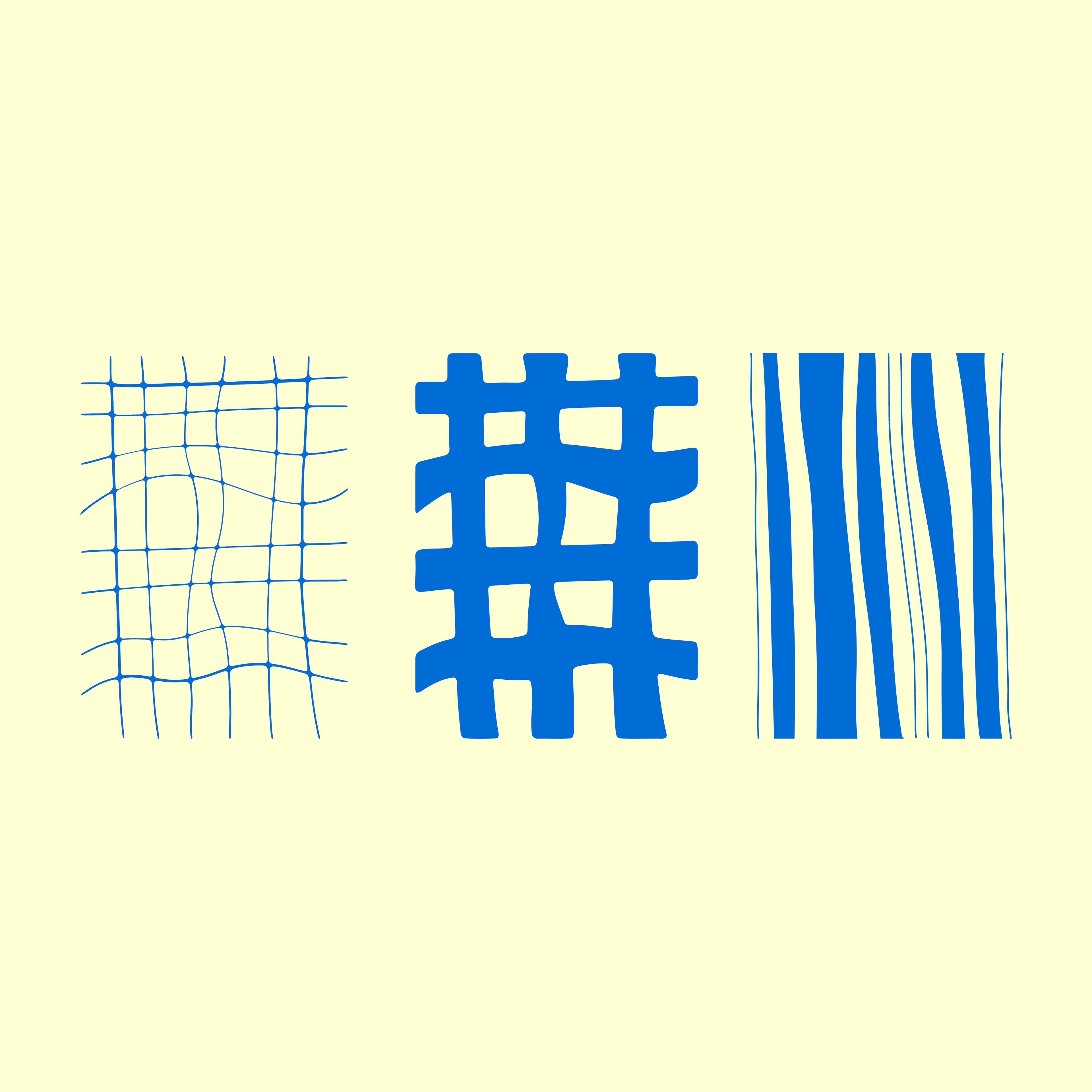
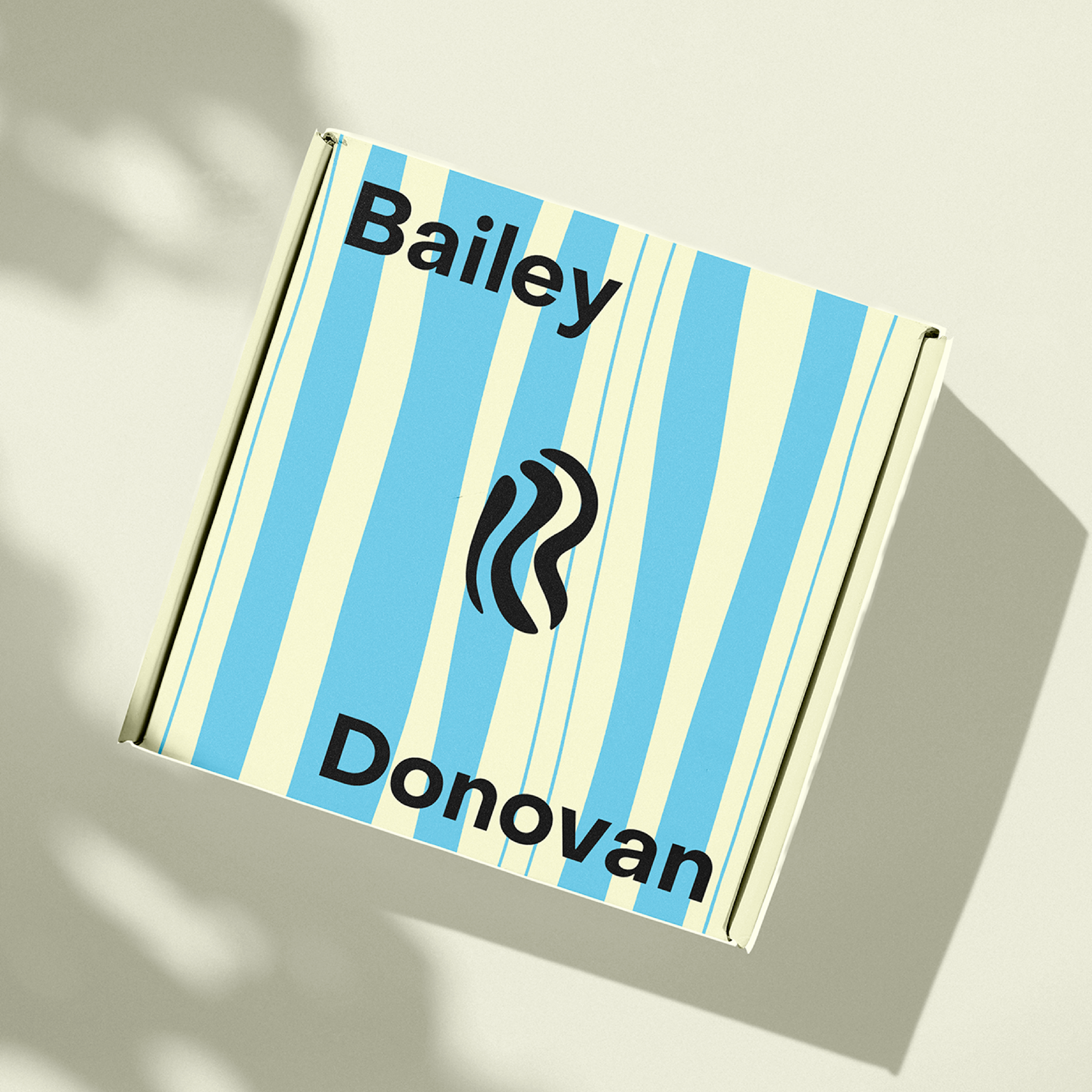
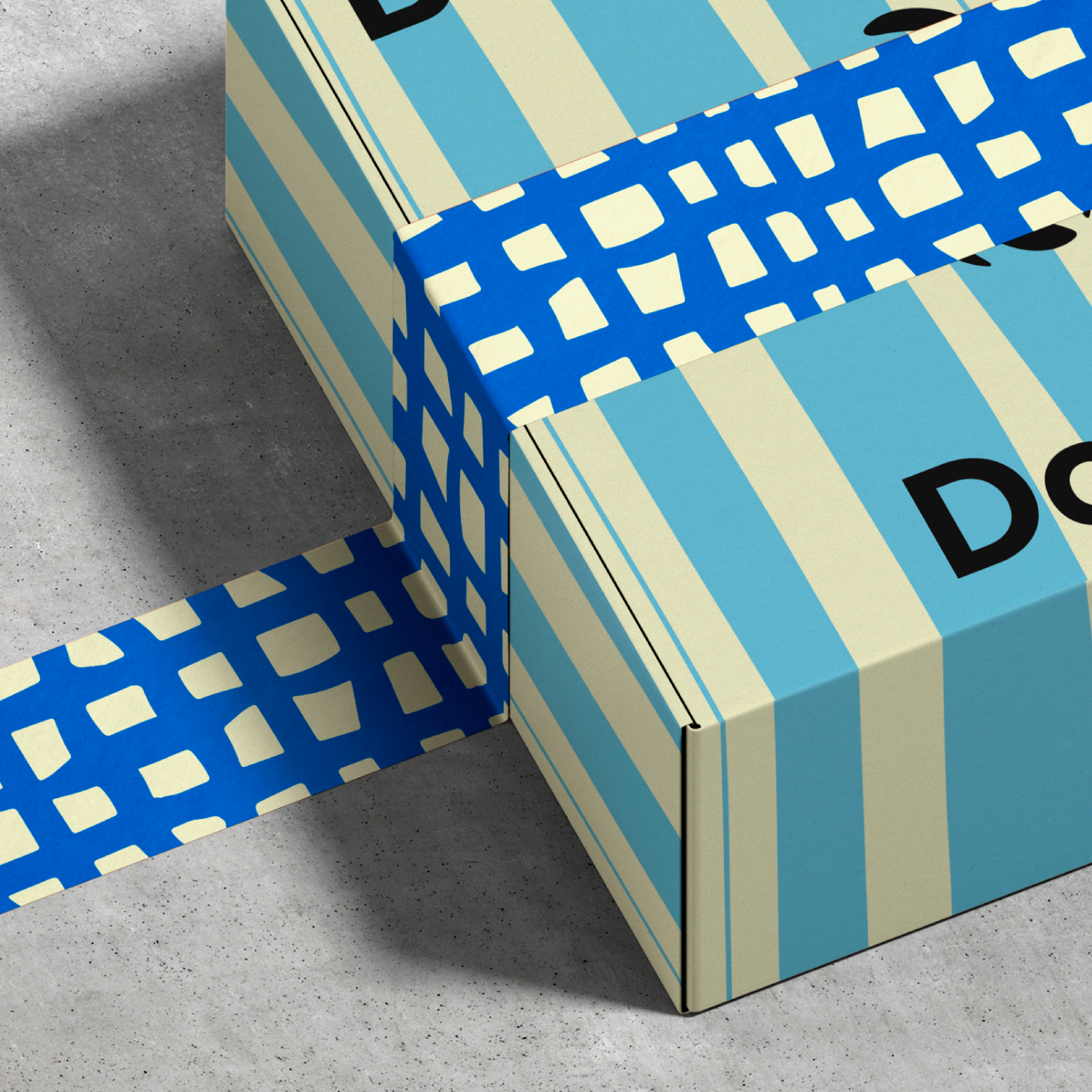
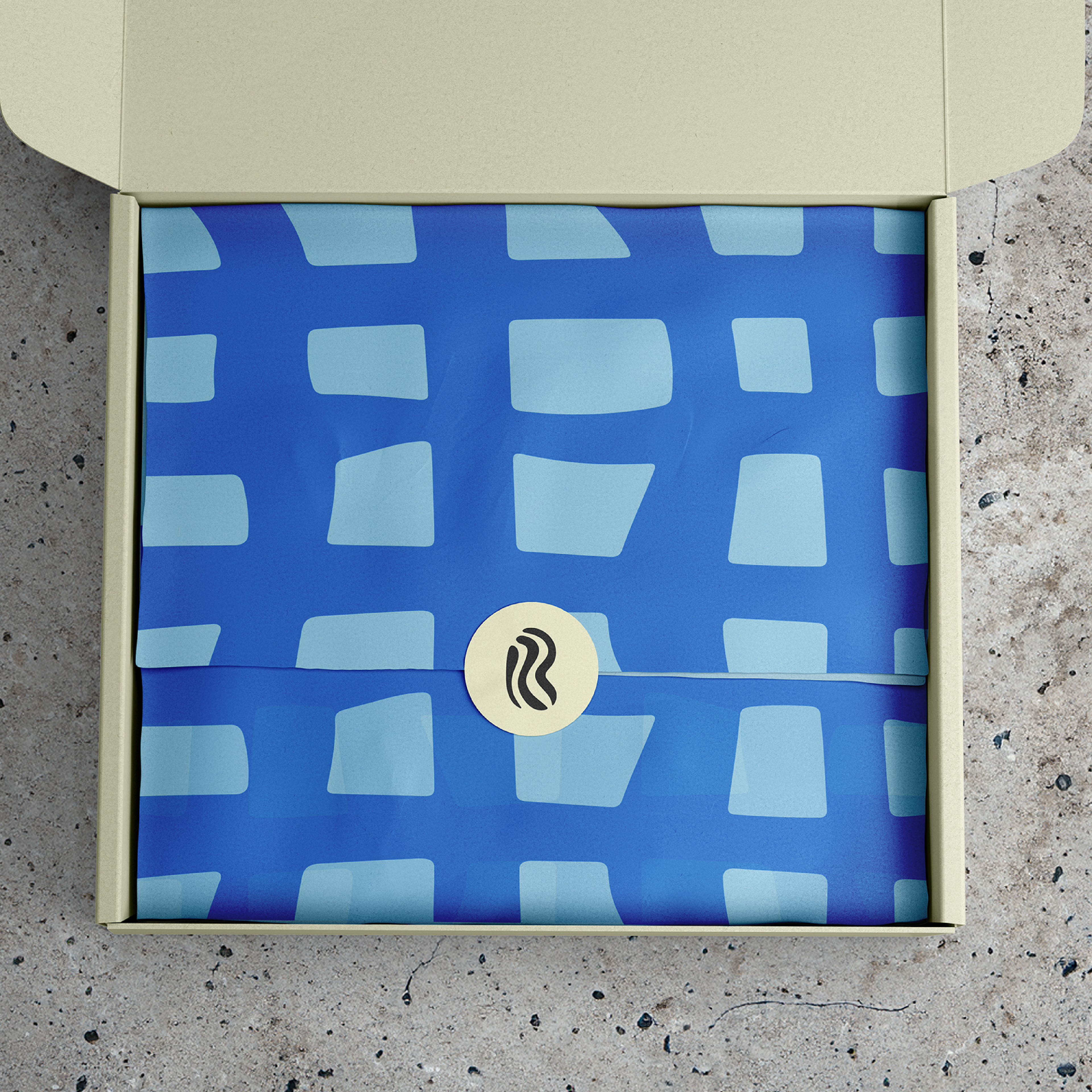

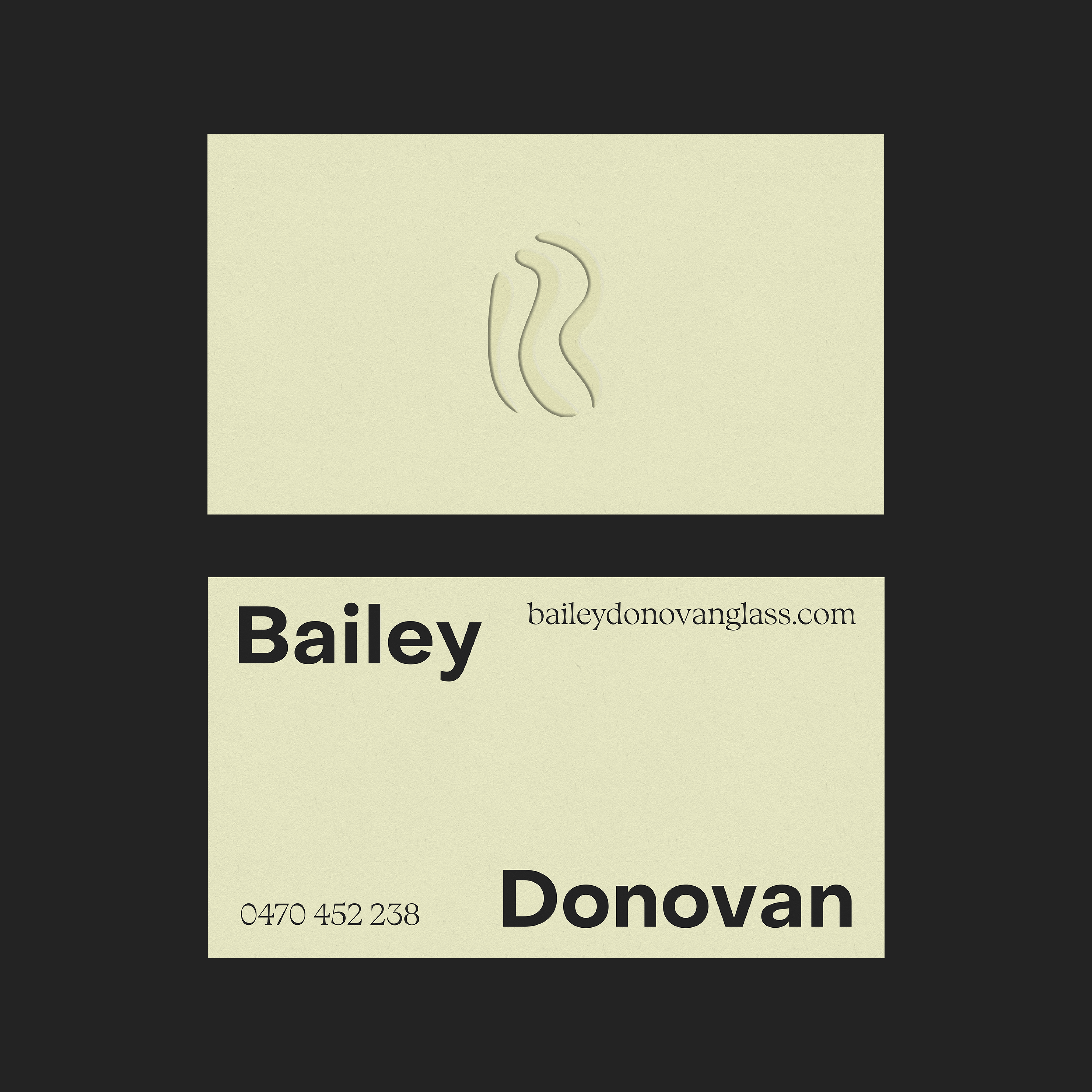
Bailey Donovan Glass rebrand in partnership with Fuller Brand Communications The ‘B’ brand symbol is inspired by the unique patterns and shapes that Bailey creates within the glass art. The patterns were hand drawn specifically to mimic the designs in Bailey’s art. A luxurious yet fun approach was taken within the shapes and colour palette. Keeping it simple with the cream and charcoal yet throwing in some pastel colours for social media and packaging. This makes the unboxing of a piece of Baileys artwork like no other.