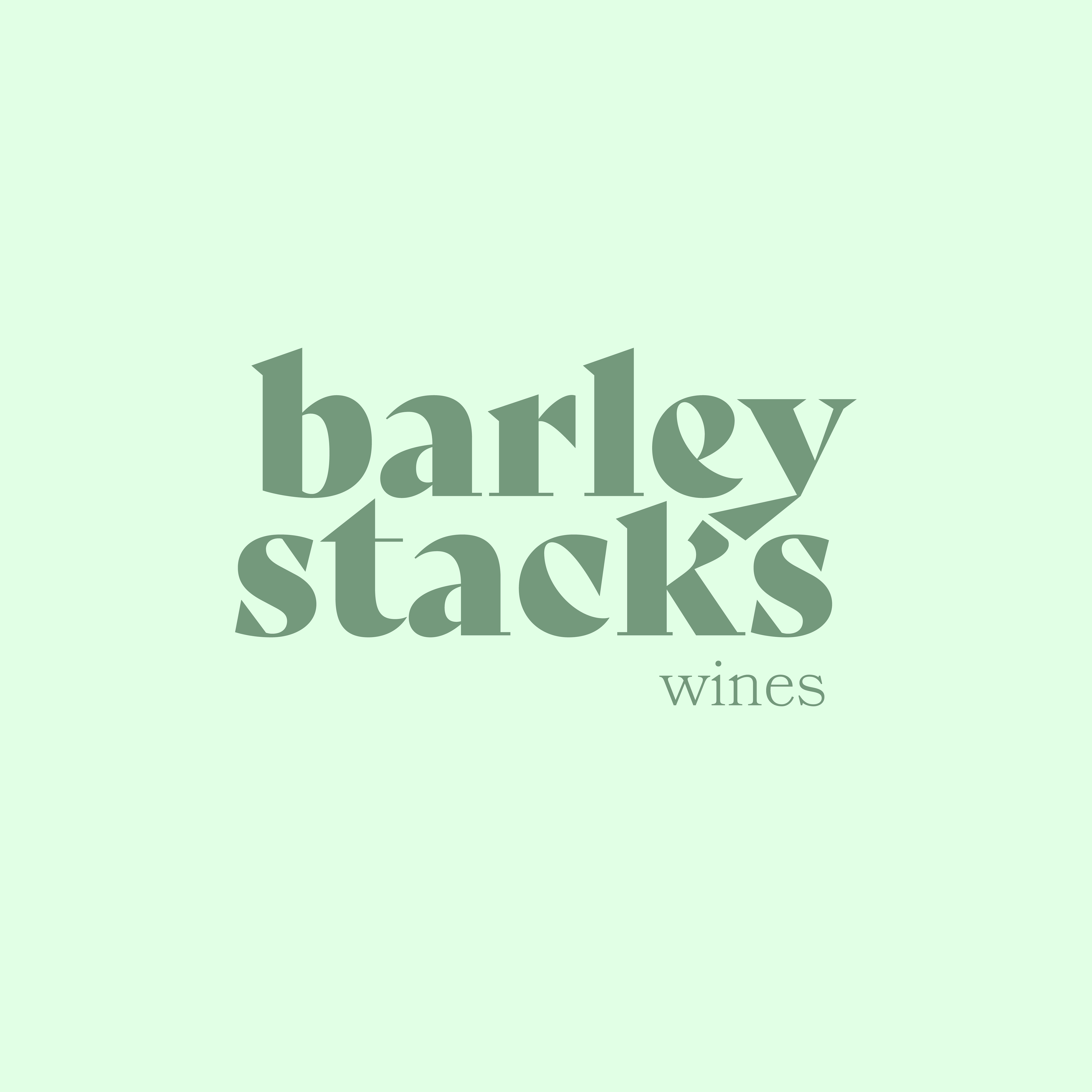
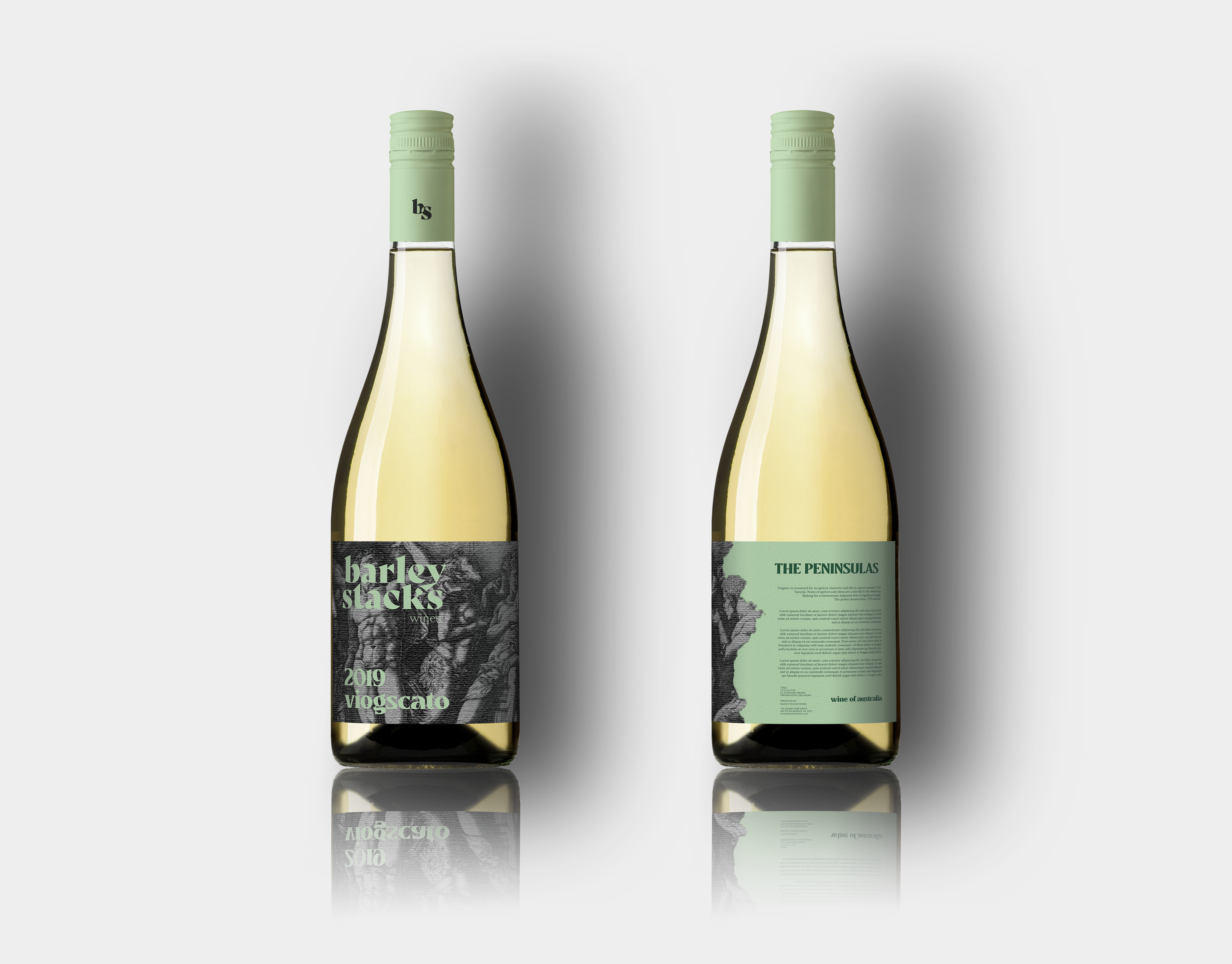
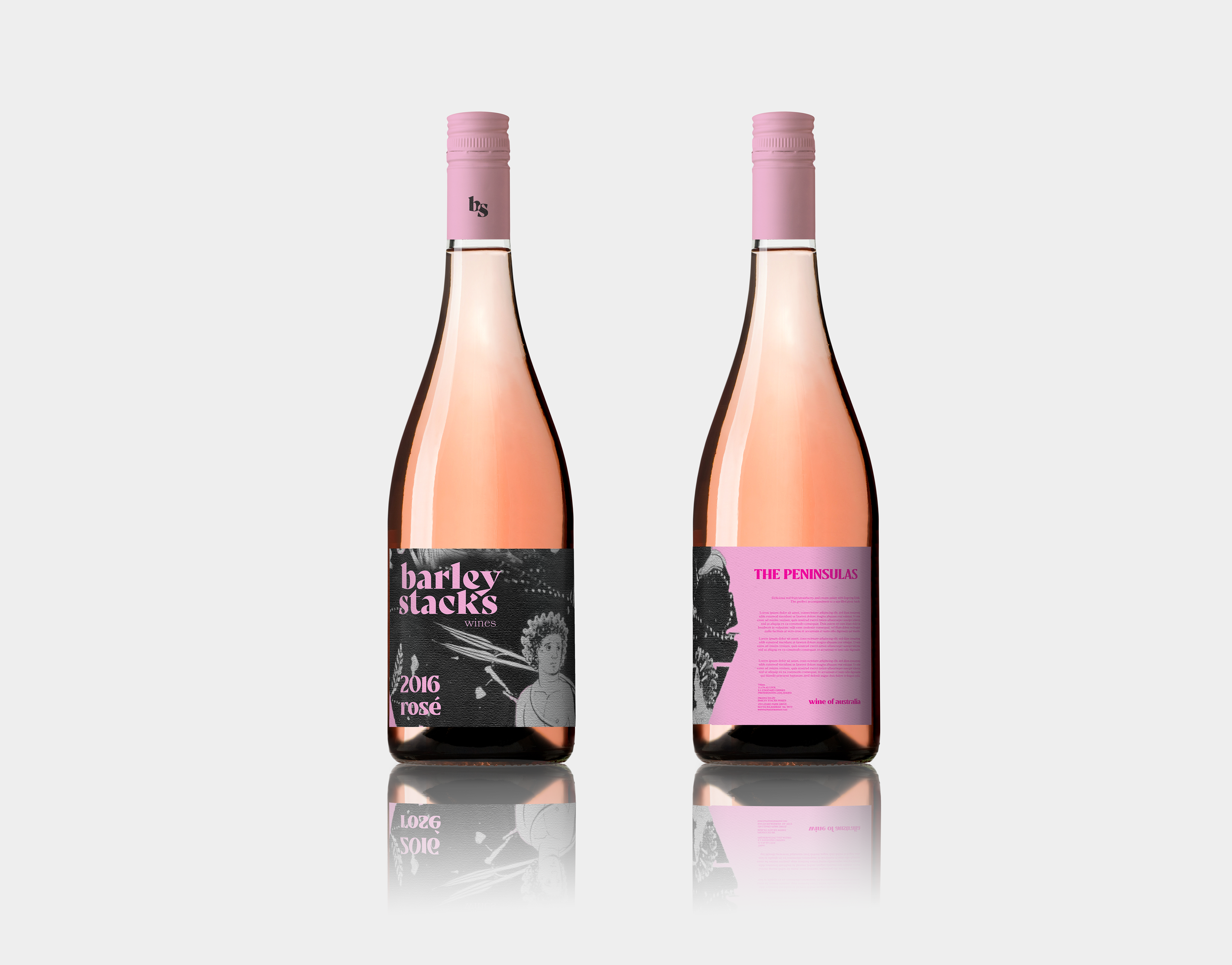
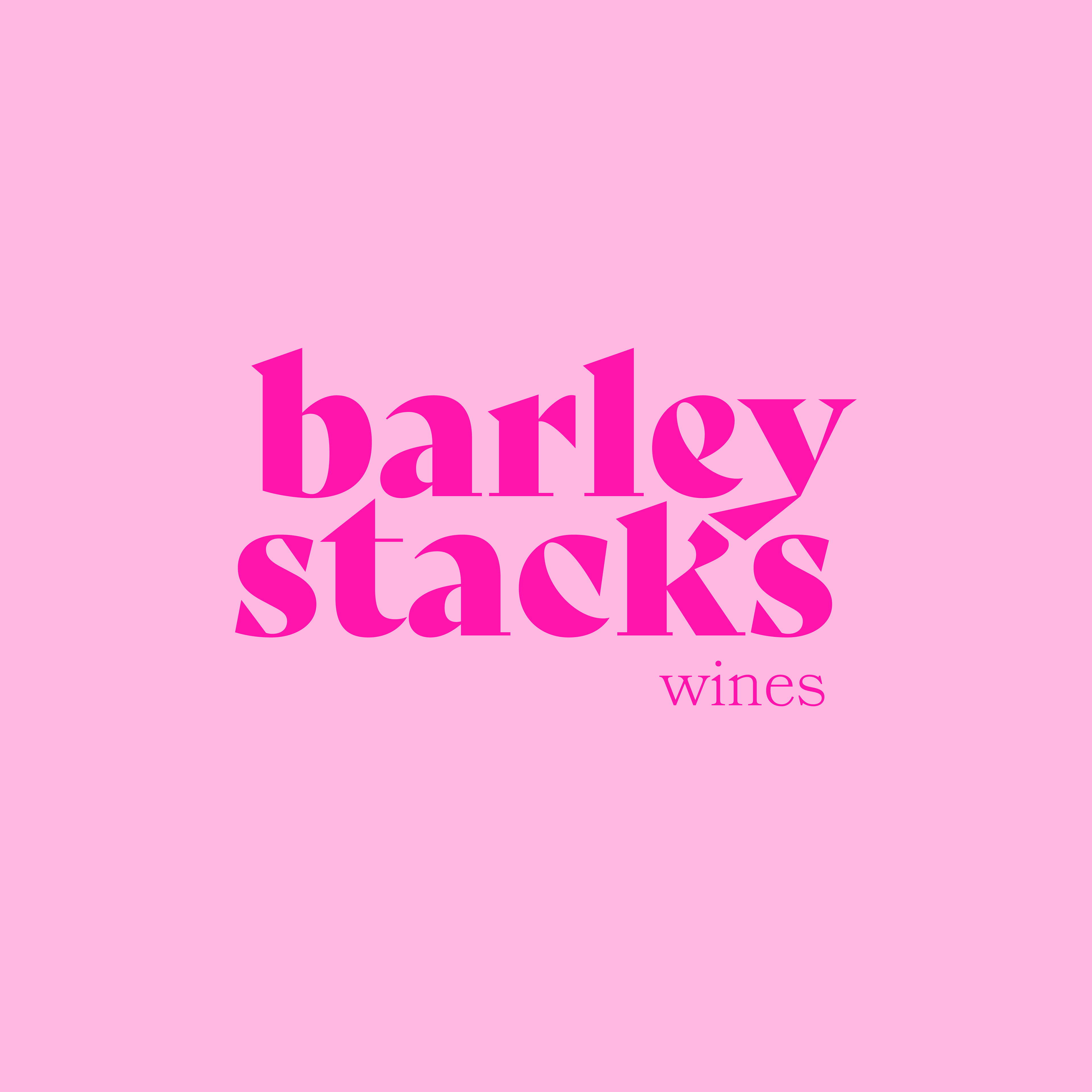
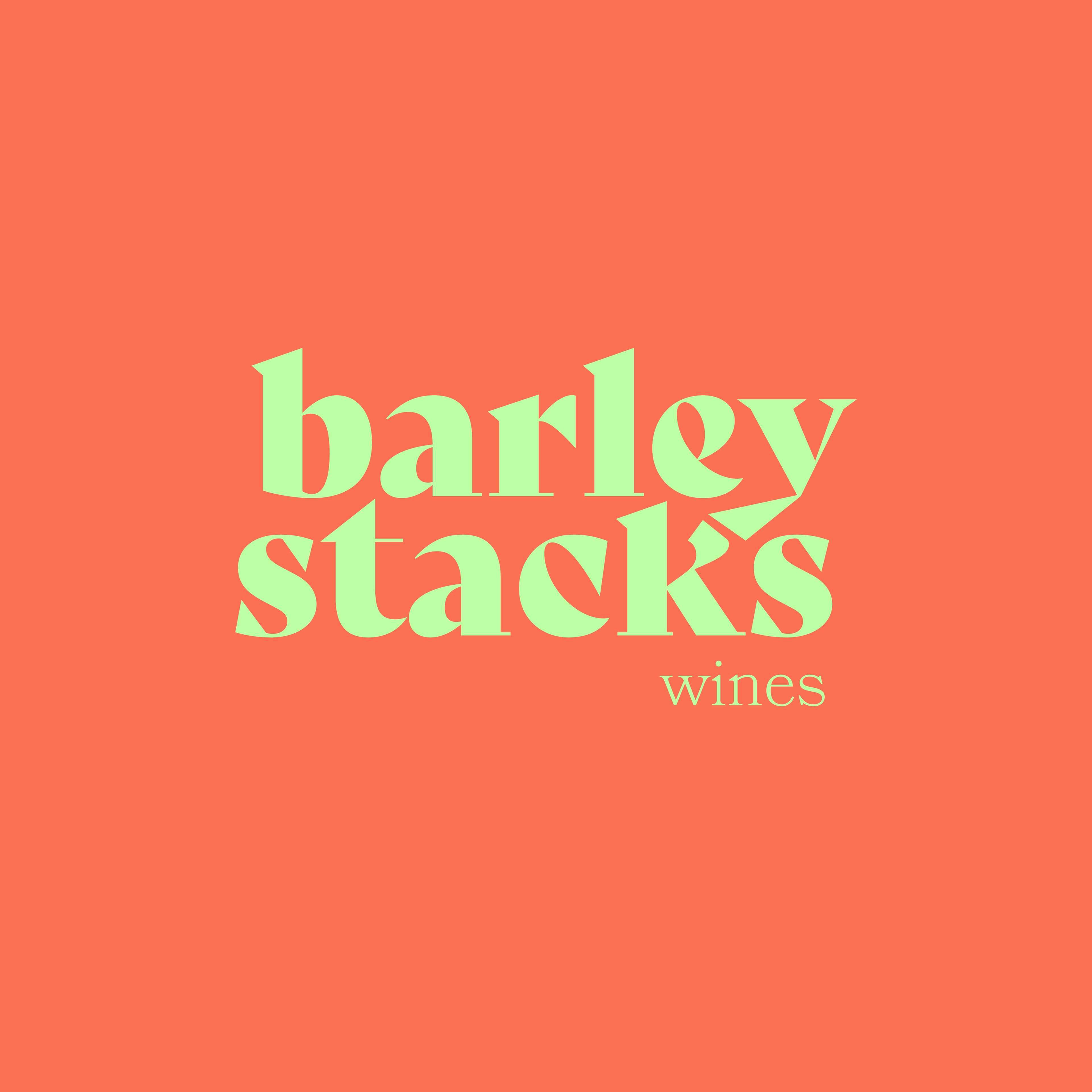
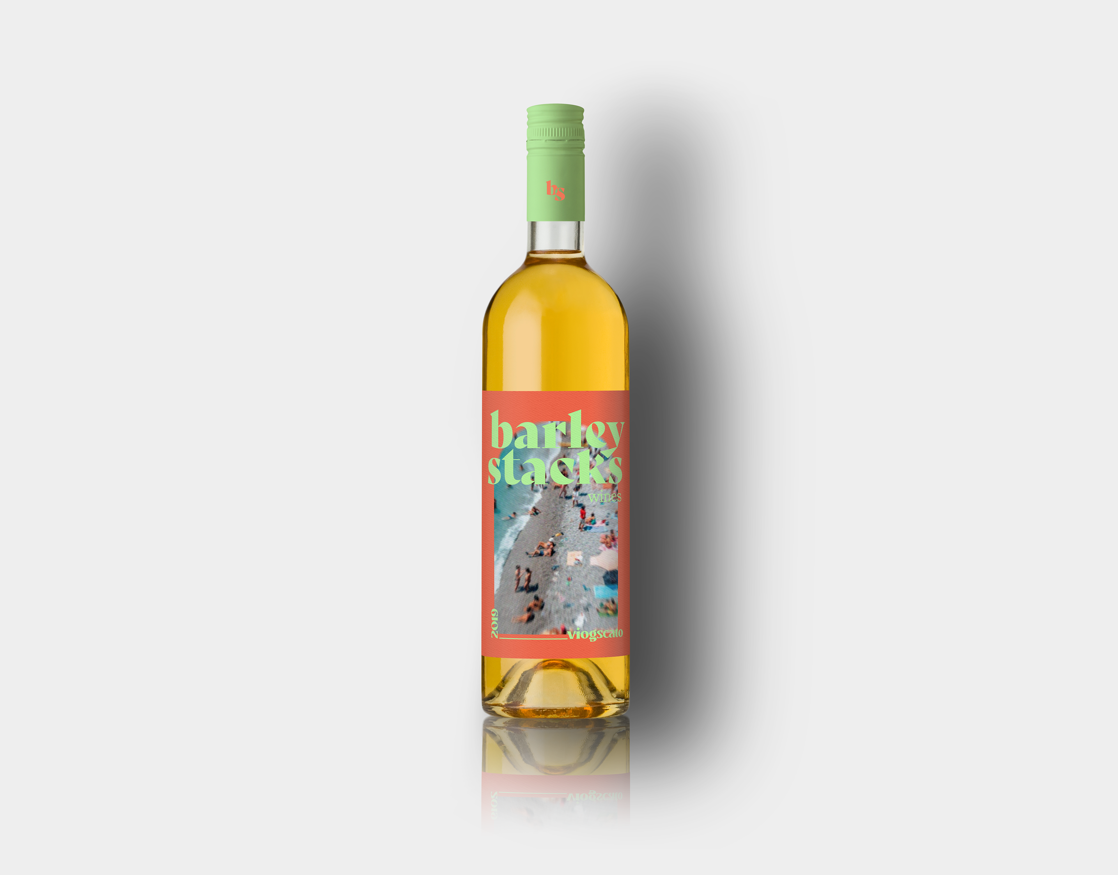
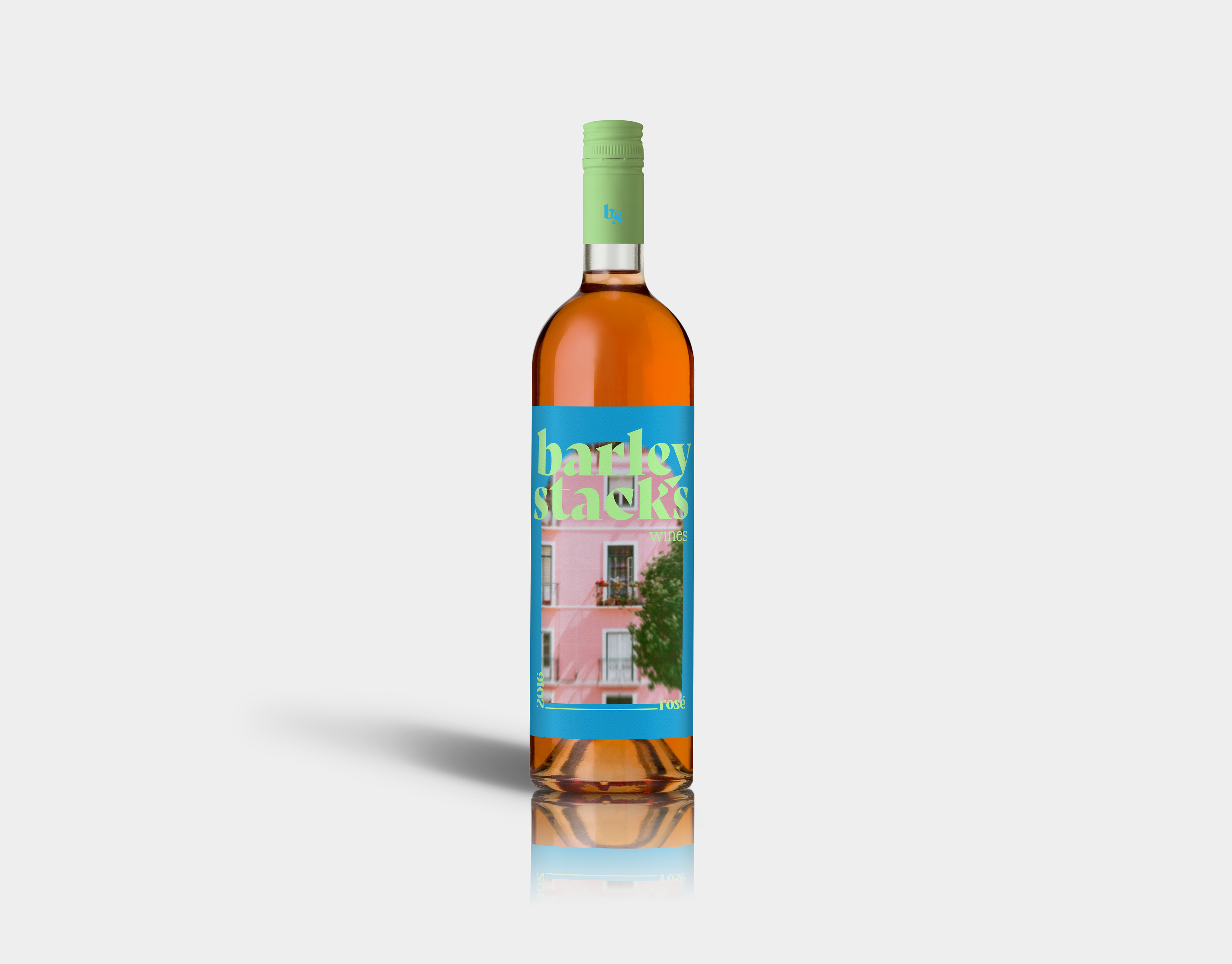
A total logo and label redesign for Barley Stacks wines on the Yorke Peninsula. Two concepts for wine labels were designed, one a more sophisticated look using fine art that utilise wine drinking from The Met open access collections. The other being a more fun interpretation of the flavours and notes of the wines, which also takes a more modern approach. The updated logo uses a stacked look to represent the name of the winery and is a contemporary take on the previous logo, keeping it minimal yet effective.