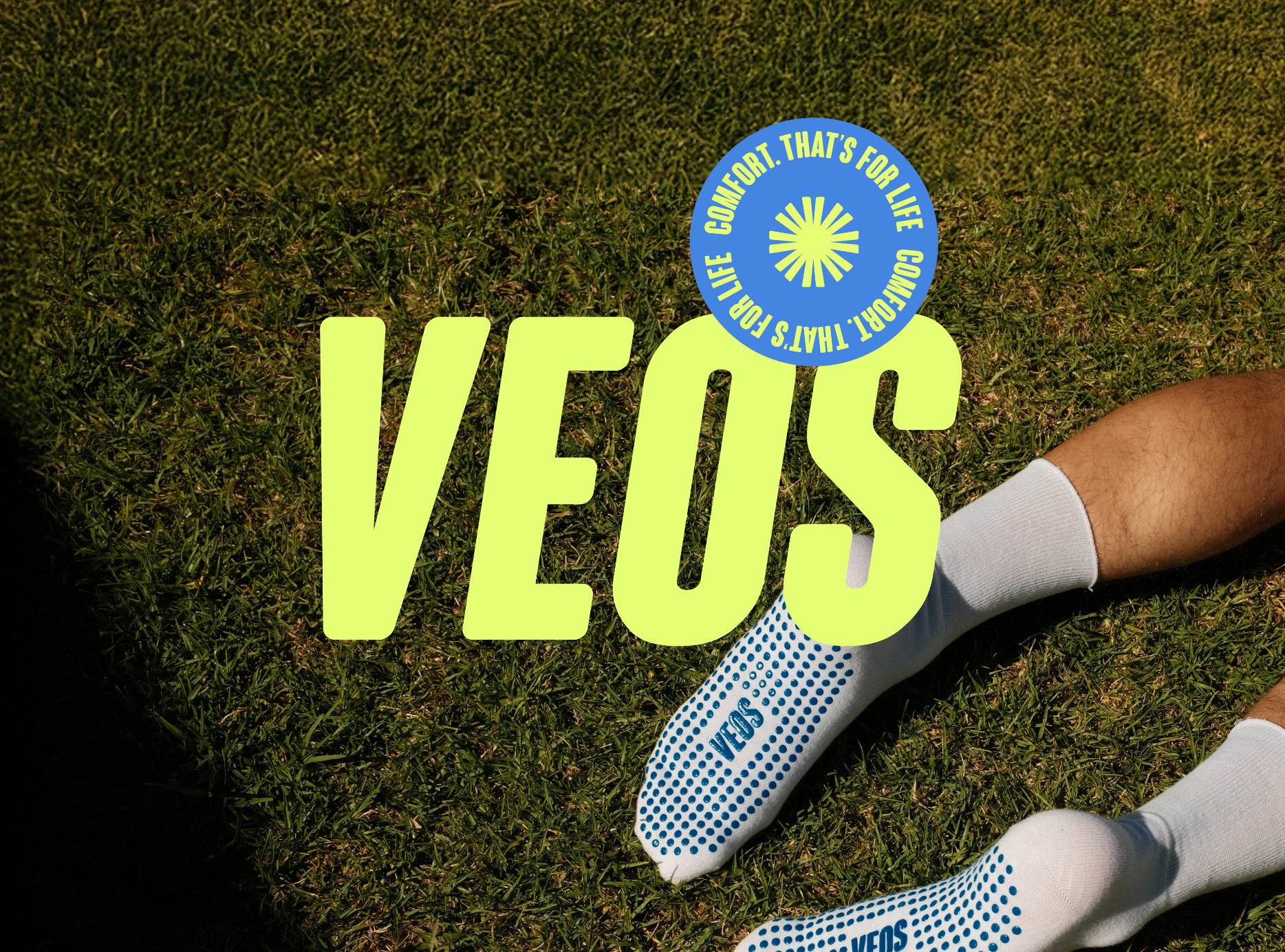


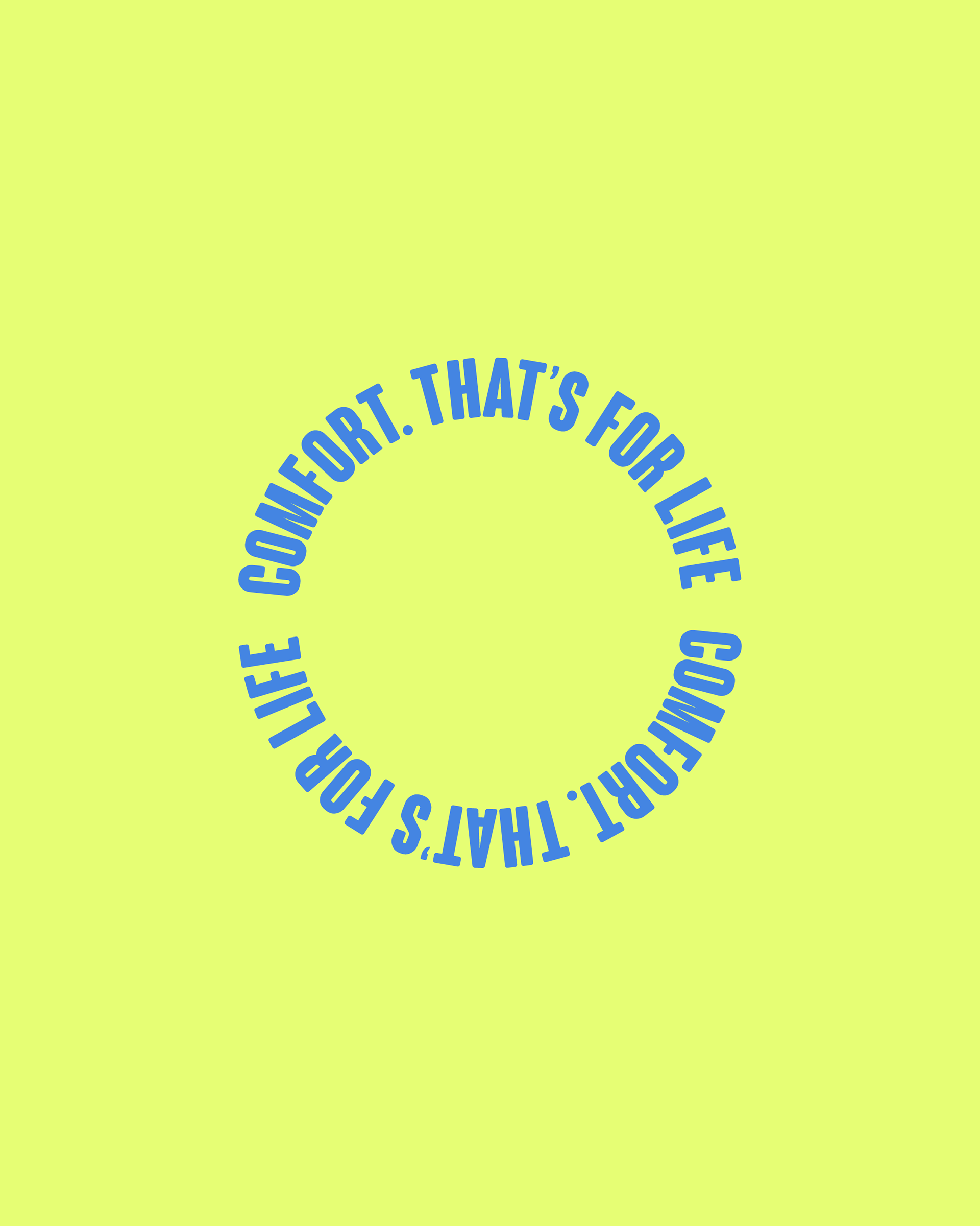
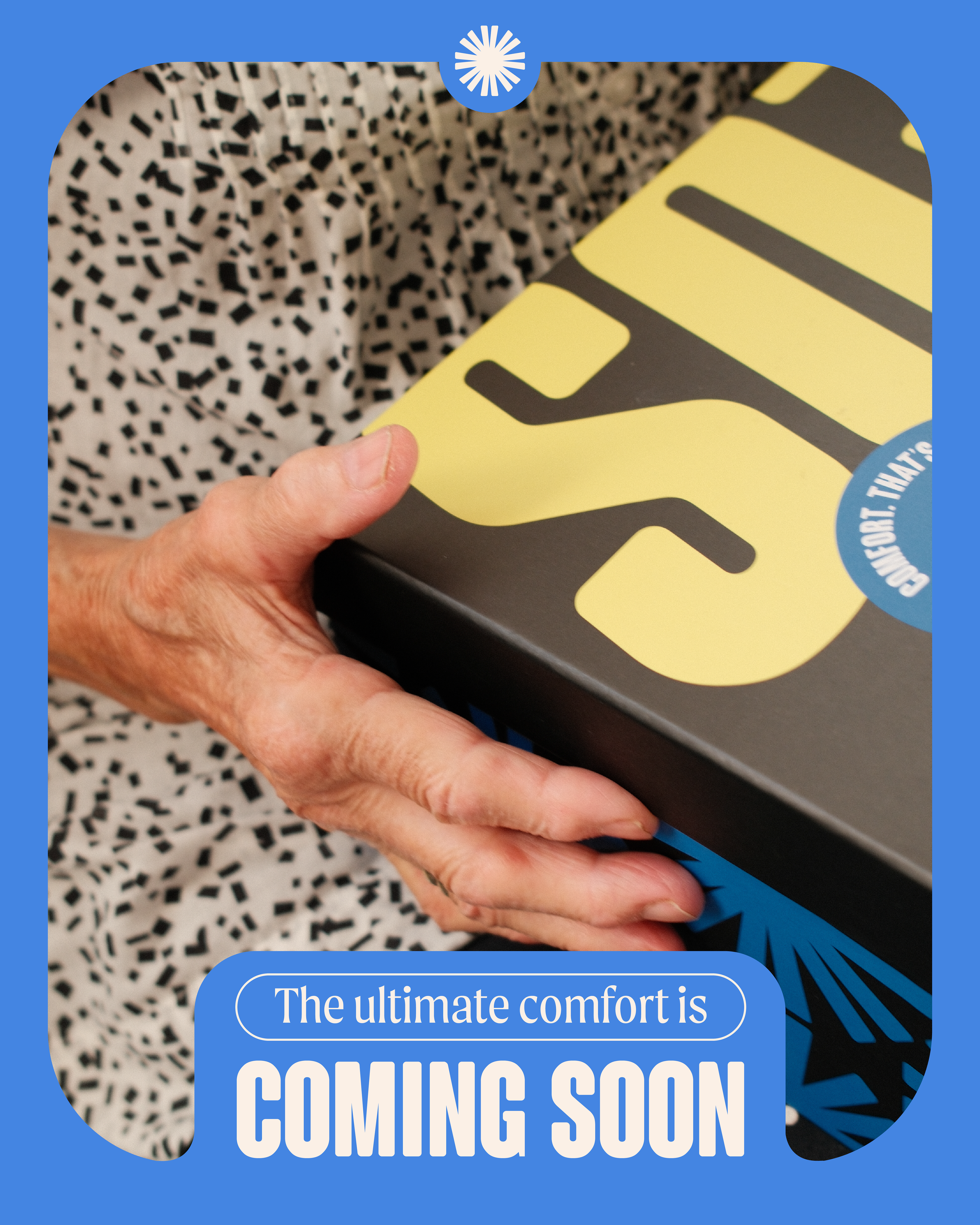
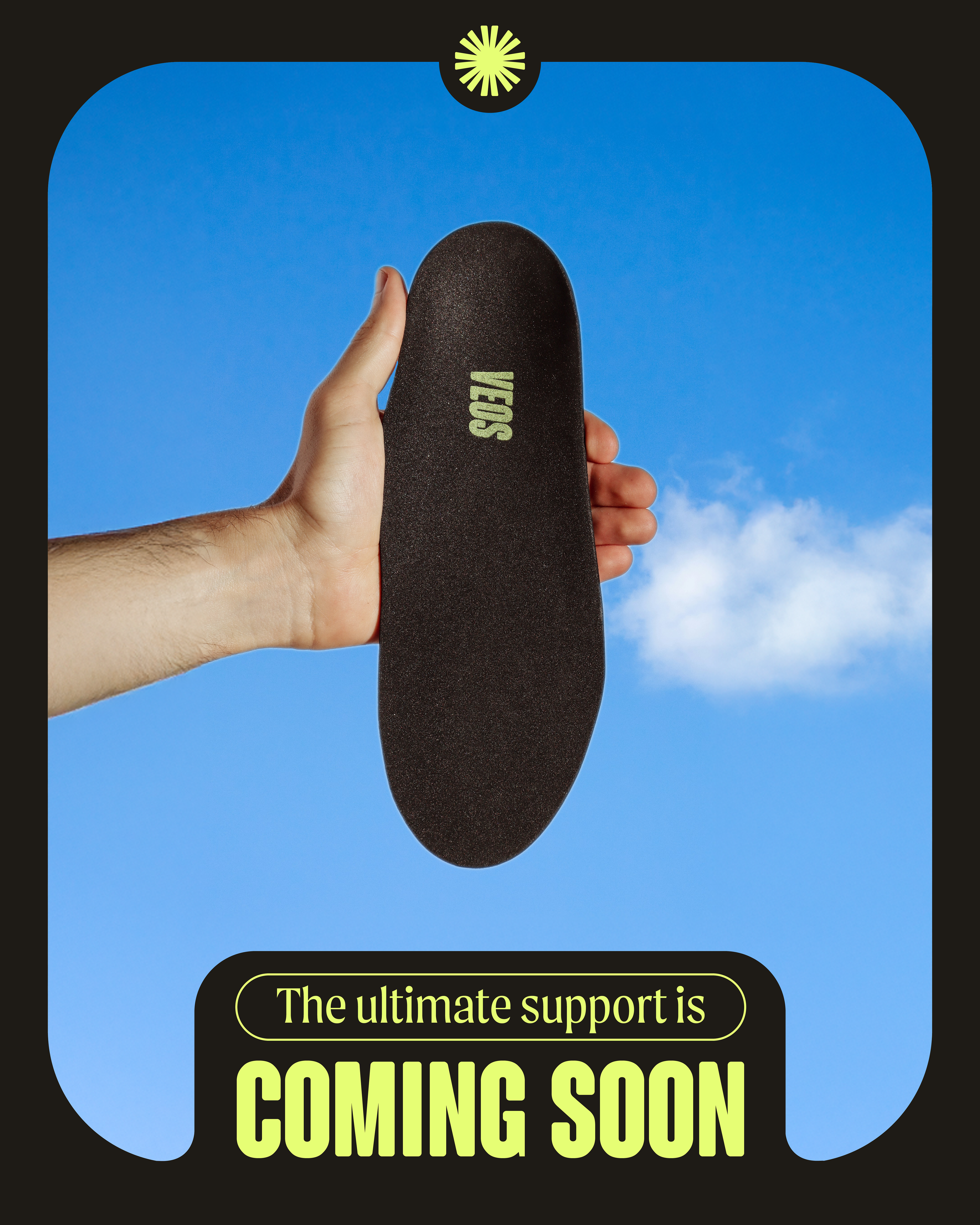
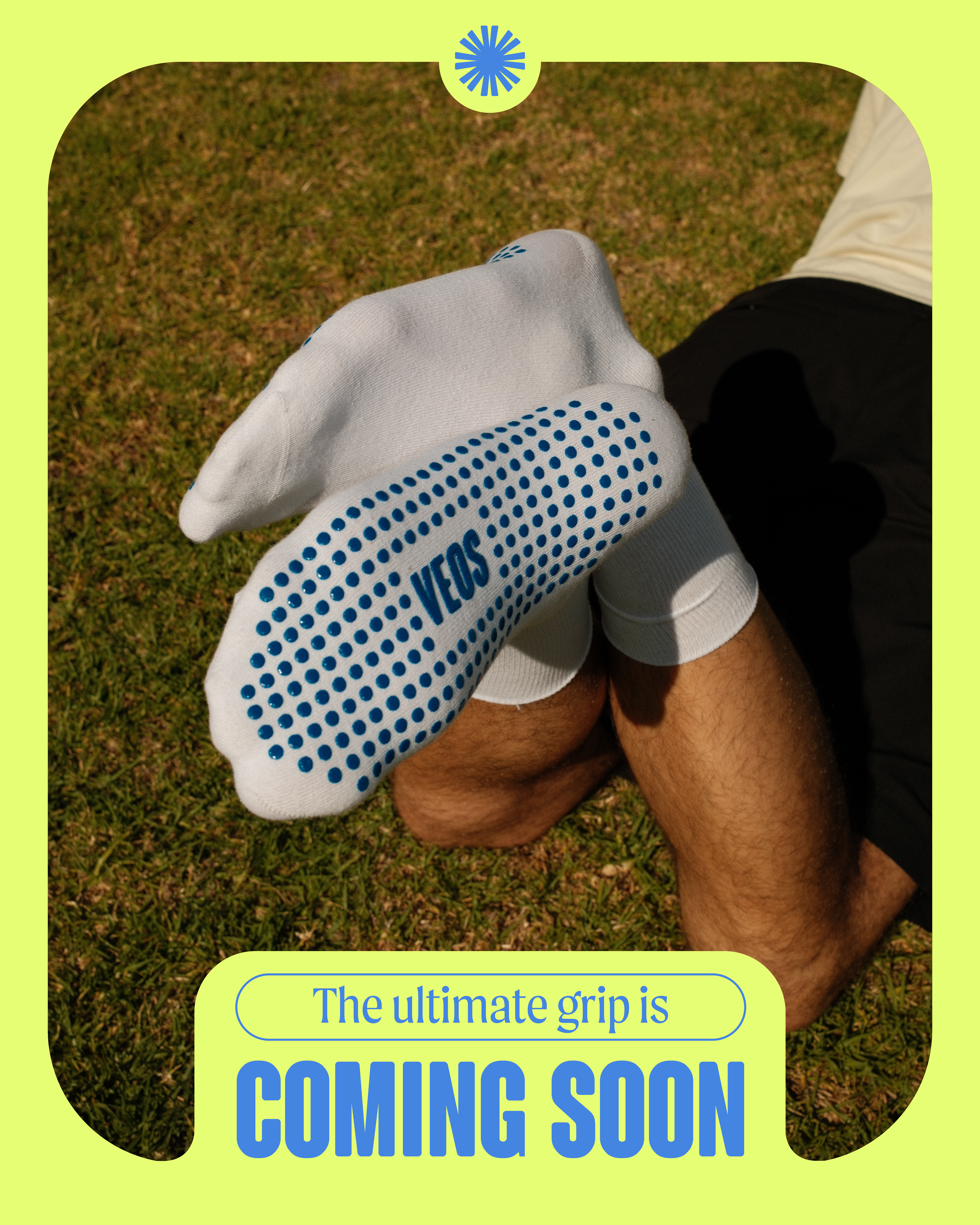
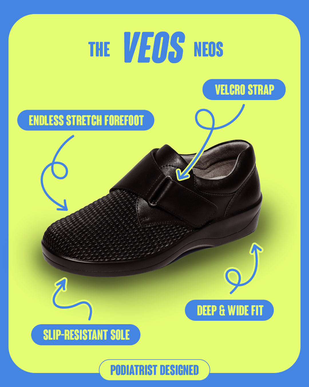
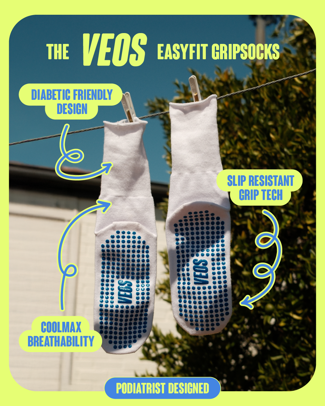
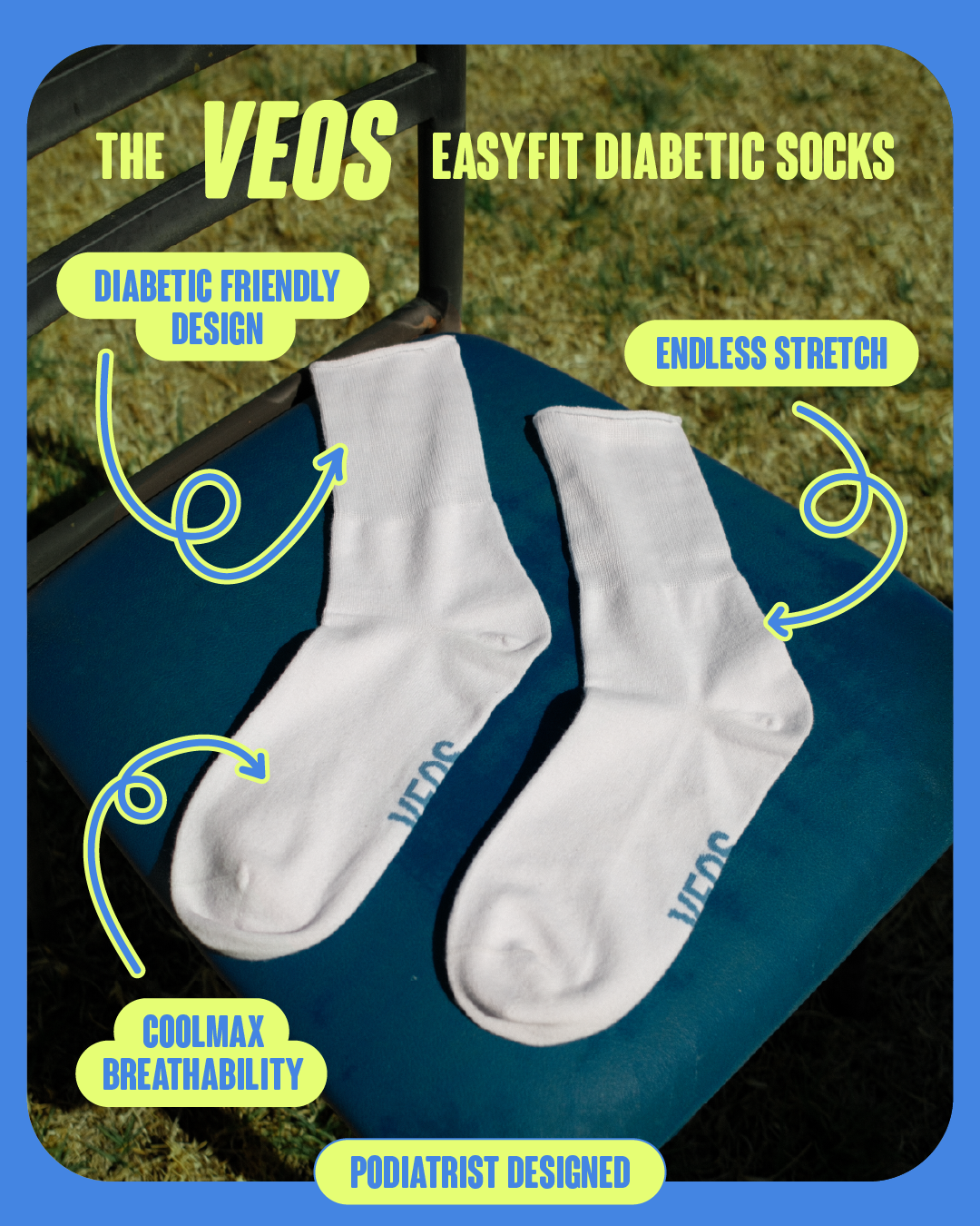
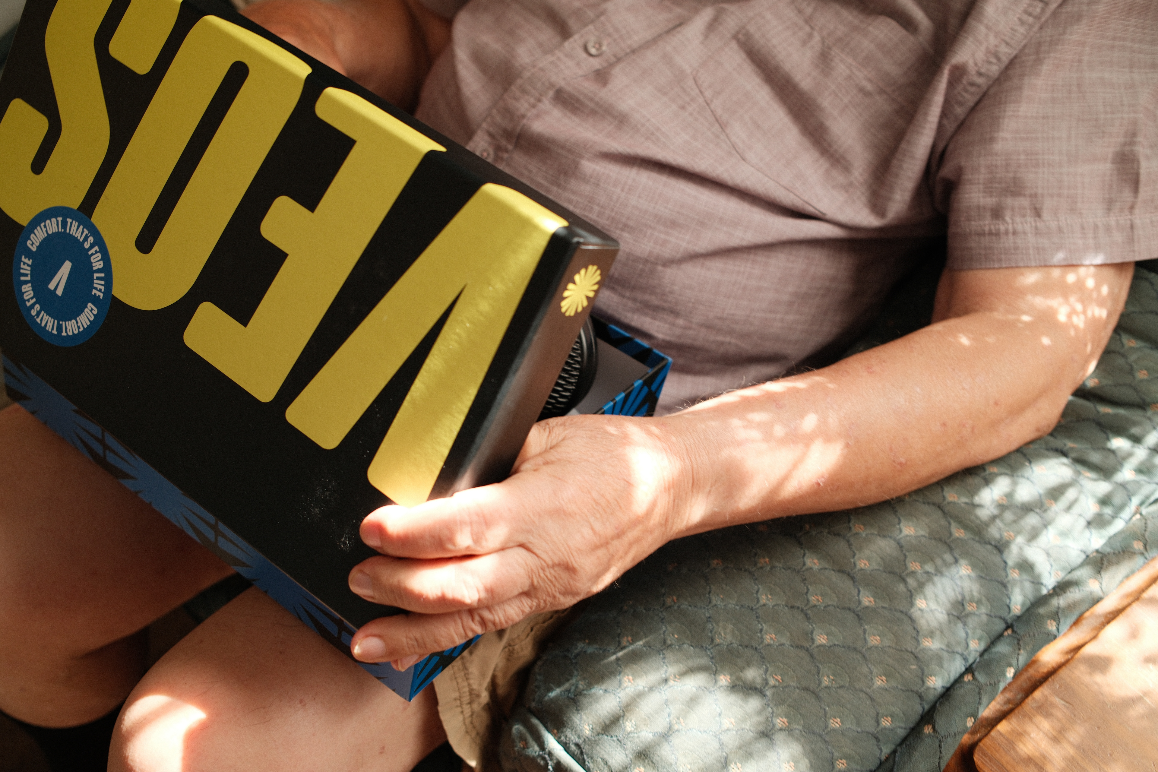
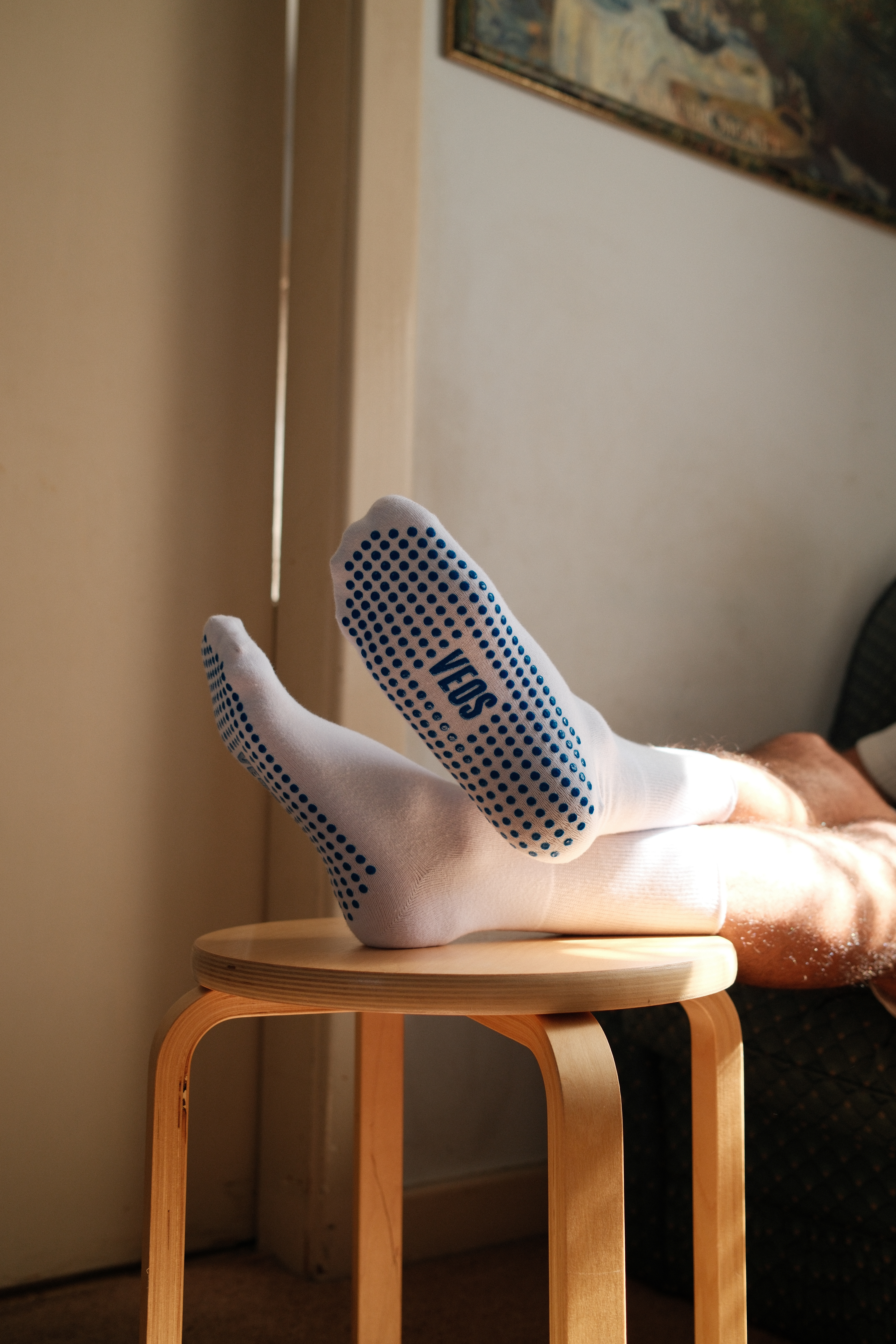
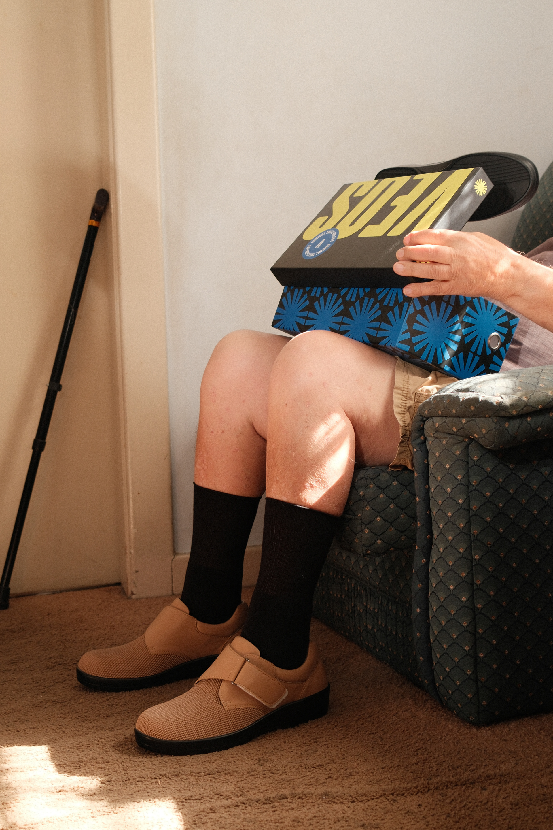
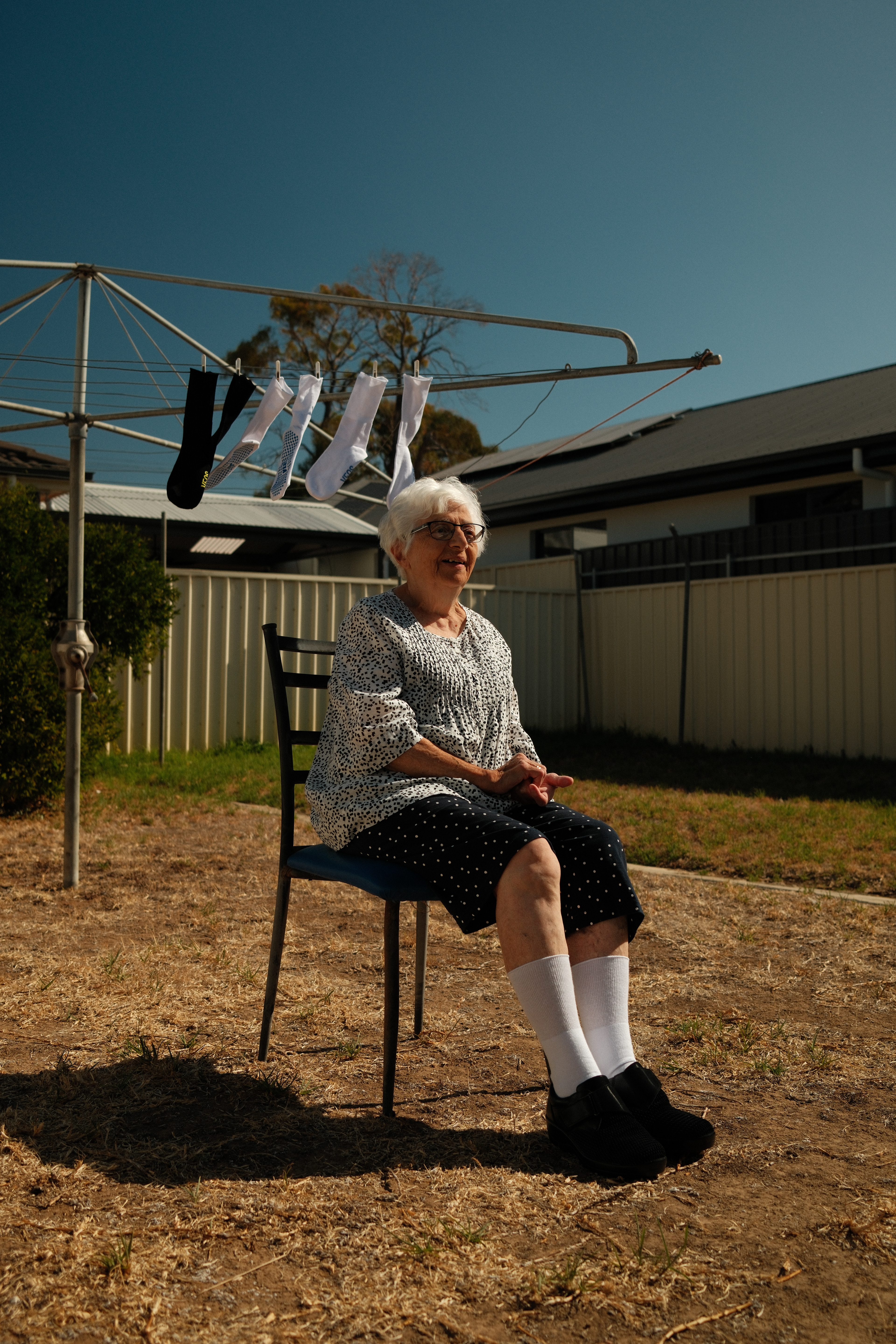
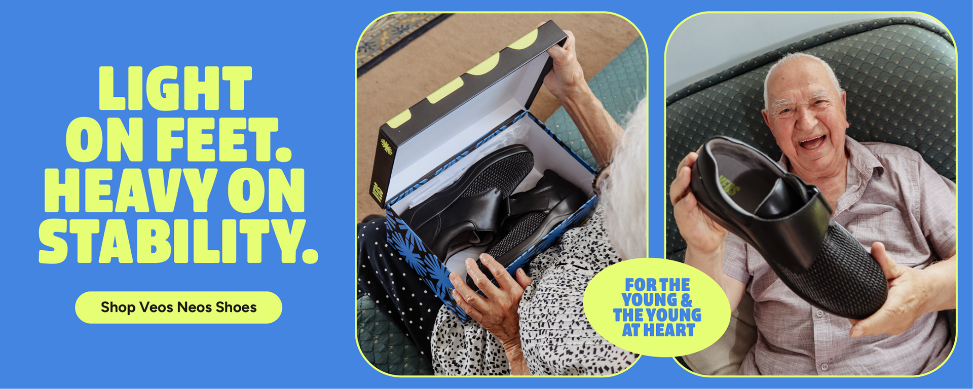

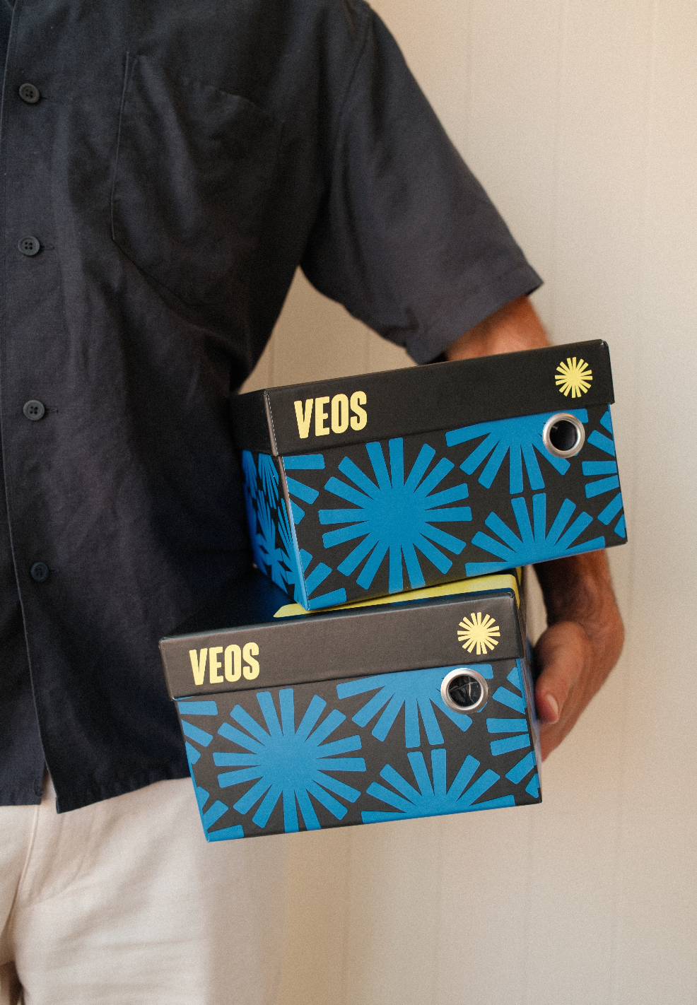
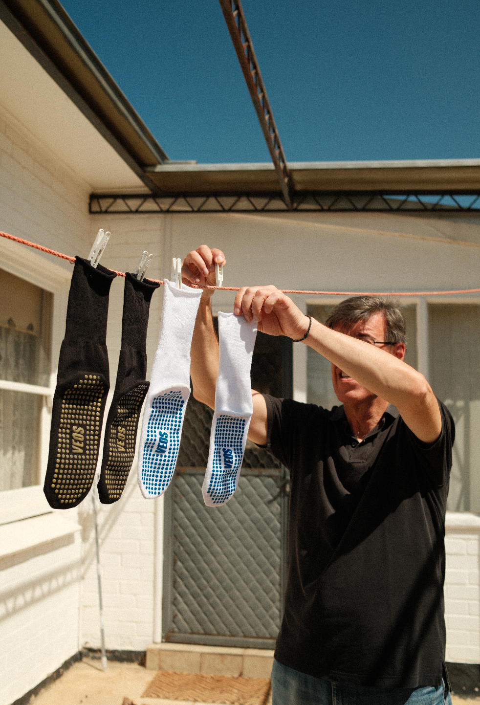
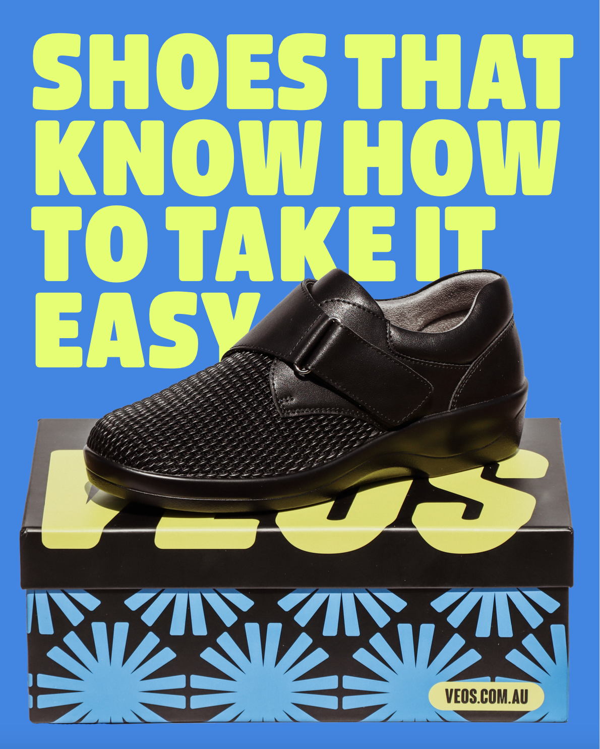


VEOS Co. is a podiatrist-led footwear brand redefining comfort with bold style and a vibrant, modern identity. Designed with older adults in mind, but with a youthful mindset at its core, VEOS breaks away from the clinical aesthetic of traditional therapeutic shoes. As Art Director, I was involved across every stage: name ideation, brand strategy, visual identity, packaging design, and photography. I developed the name VEOS (from the Greek βίος, meaning “life”) and the tagline Comfort. That’s for life., capturing the brand’s mission to make comfort aspirational. The design features energetic colours, confident typography, and the Veos Star, a symbol inspired by the Star of Vergina and the Greek migrant community in Australia. This project was about more than footwear—it was about legacy, culture, and challenging expectations. I'm proud to have helped bring it to life.